

I’ve recently become indulged in the art of typography, the multidimensionality of text has opened me up to new means of mixed media. With typography, possibilities stretch beyond face value, there is the opportunity to tell a story, create emotion and be part of a graphic design or photographic work (my two favourite areas!)
As with all things artsy, aesthetic is key. With type, it is especially hard for people to visualize it as an art form. We are all so used to the idea of fonts already being preset for our essays and papers. After hearing Times New Roman point 12 so many times, it almost becomes second nature to use it. Therefore, we have to train our eyes to see text as less of a technicality and more of a design.
So, when trying to get creative with your fonts here are a few tips that will help!
Kern and lead:
Kerning (spacing between the letters) and leading (distance between lines of text) make a huge difference especially in the way people read your body of work and how interesting it looks to the viewer ( which could determine if they continue reading in some cases)!

Text that is too tight can give a feeling of urgency and discomfort. While text that is spread out leaves more room to breathe, it is also more unique and simple.
Mixing fonts:
The most important thing to remember when mixing different fonts is that contrast and balance are the two main elements to creating an interesting piece. Some interesting and unique combinations could be…
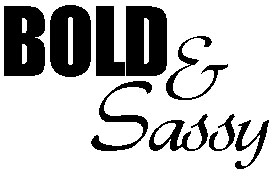
Sassy and BOLD:
Tall and THICK:

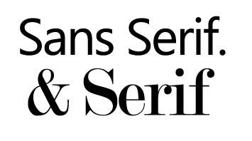
Sans serif with a serif:
The best part about mixing fonts is the possibilities! There are an unlimited amount of combinations and downloading fonts makes it impossible to decide which one is the right one! These are some great sites to download free fonts and play around with your own combinations, see what works:
Some creative things to try with type:
Think outside the box! Use text to help visually explain meaning:

Make use of negative space between characters:

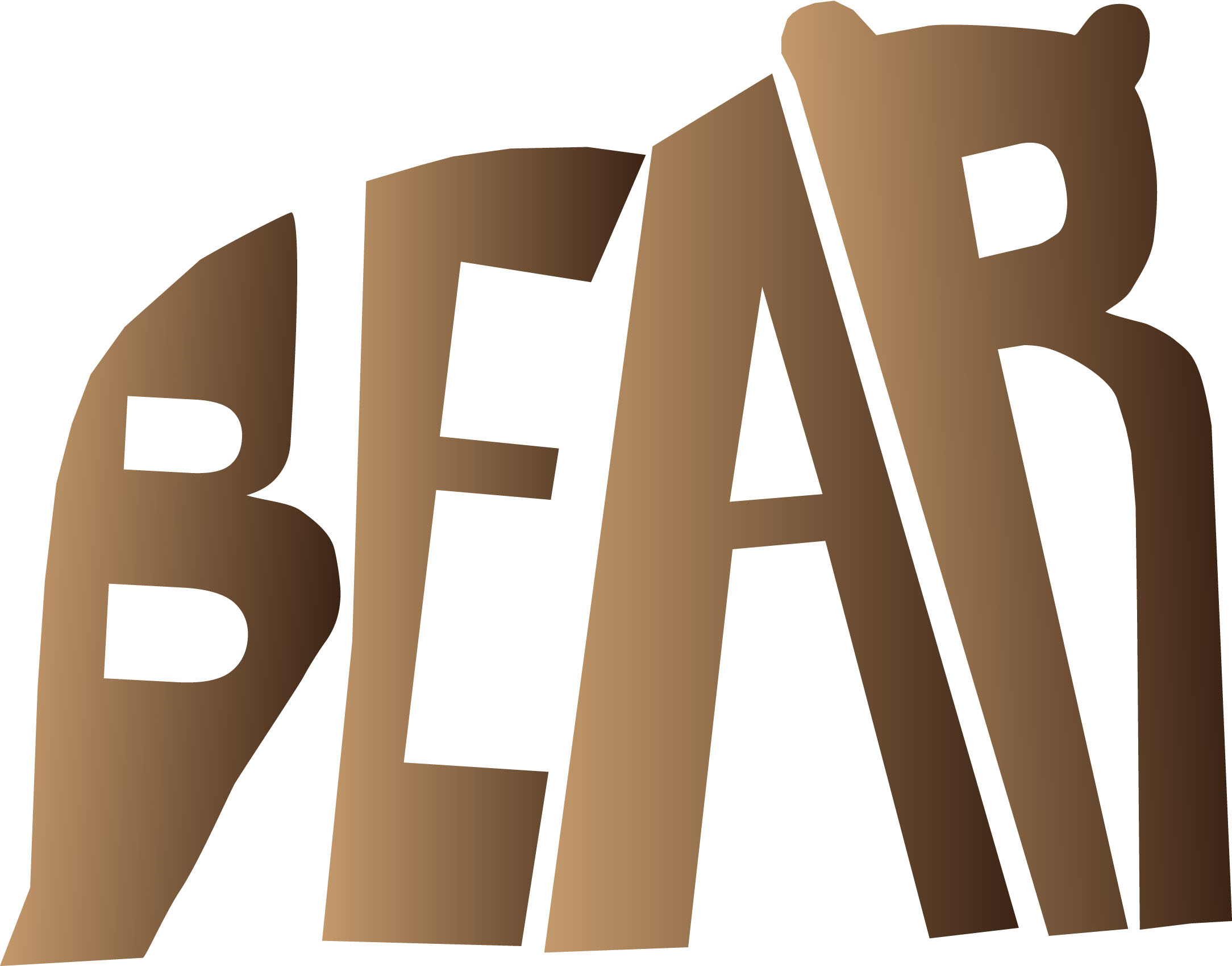
Use letters to create an image:
Minimalist typography designs are often the most effective and visually intriguing:

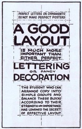
Finally, when thinking about your design, it is important to realize that this isn’t like writing a paper for your law class. There has to be detail and purpose of the design that draws someone to not just to read but to see. This quote is what has taught me the most important lesson in type:
We would love to hear some of your typography design tips. If you’re feeling inspired, share some of your favourite typography work!
